
Ink, Identity, and the Weight of Being a Man: The Grey Printer in Inspiró Issue 3
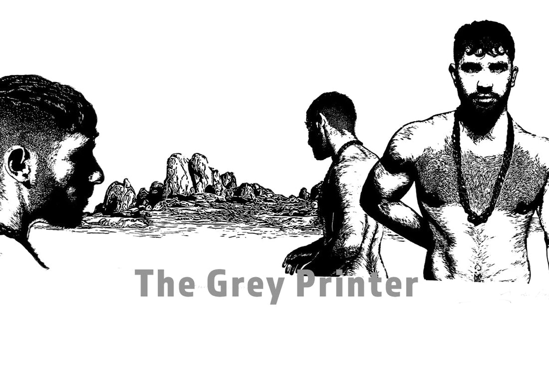
There is something profoundly confrontational about a linocut. The knife goes in. The wood or lino resists. And what remains, after all that force and intention, is an image that cannot be taken back. It is a medium built on commitment. It suits Jaco du Plessis, the South African queer artist who operates under the name The Grey Printer, completely. We're proud to feature him in Inspiró Magazine's third issue.

Du Plessis was born in 1981 in Witbank and trained at The Open Window in Pretoria, graduating in 2003 with a National Higher Diploma and the distinction of Top Visual Arts Student. He studied under printmakers Diane Victor and Christiaan Diedericks, two of the sharpest practitioners in South African printmaking, and their influence lodged deep. But the work he makes now is undeniably his own: stark, precise, emotionally unguarded, and resolutely focused on the male body and the male interior life.
His medium of choice is the linocut, worked almost exclusively in black and white. That choice is no aesthetic accident. Du Plessis has spoken about how the high contrast of the two tones reflects the core tension in his practice: the duality running through every piece of work he makes. Good and evil, light and dark, softness and hardness, vulnerability and strength. He describes white as the great balancer in his prints, the negative space that does as much work as the carved lines themselves, unnerving the image and giving it something to press against.

The subjects that populate his work are men. Specifically, they are men caught in the kind of emotional terrain that mainstream culture still struggles to draw honestly. Growing up inside a conservative white Afrikaans culture in South Africa, du Plessis was asking hard questions about masculinity from an early age, questions about what men are permitted to feel, how men are allowed to be seen, and what gets buried when vulnerability is treated as weakness. Those questions became the raw material of his art.
His prints engage with themes of love, acceptance, and the complexity of queer male identity, not as abstraction, but as lived, bodied experience. He uses what he calls a "manly" subject matter to deliver something emotionally contradictory, the strong male figure deployed not as a symbol of dominance but as a site of exposure. It is a deliberate and quietly radical move. The physical weight of the male form, carved with fine, detailed lines into lino, becomes a vehicle for exploring what men actually carry inside.
The printmaking process itself echoes this. Linocut demands a certain violence of execution. You cut away the material that would hold ink, and what prints is whatever survived that removal. Du Plessis works with short, intricate carves that build up complex texture within figures that might otherwise read as blunt or simple. The result is a body of work that is simultaneously bold in its graphic impact and delicate in its construction: muscular on the surface, layered beneath.
His career trajectory reflects the international reach of the work. He won the Rosendal Art Gallery's Miniature Print competition in 2018. In 2020 he took part in the Rust-en-Vrede gallery's all-male exhibition "Boys Don't Cry," a title that could almost serve as the thesis statement for his entire practice. In 2021 he was a finalist in the Prisma Art Prize and exhibited at Contemporary Venice at THE ROOM Contemporary Art Space alongside artists from around the world. He was also invited that same year to exhibit at the 14th Annual Joburg Fringe Art Exhibition.
That international footprint matters. Printmaking as a medium, and queer African art as a category, are both vastly underrepresented on the global stage. Du Plessis occupies a position at their intersection, carrying work that is rooted in a specifically South African experience of gender, identity, and sexuality, while speaking in a visual language that travels.

Now, his work appears in Inspiró Magazine Issue 3, published through The Male Muse. Inspiró is one of the few platforms in contemporary queer publishing that treats fine art printmaking with the seriousness it deserves, placing it alongside photography and illustration in a publication that is genuinely invested in the full range of queer visual expression. Issue 3 features twelve international artists across 108 pages, exploring love, lust, vulnerability, and self-expression, and du Plessis belongs in that company without question.
His inclusion signals something important. The conversation around queer masculinity in art has expanded enormously in recent years, but there remains a shortage of work that approaches the male body not as spectacle or symbol, but as a complex psychological and emotional subject. The Grey Printer does exactly that. He carves into lino and pulls out images of men who are permitted, finally, to be complicated, men who carry their desire and their doubt in the same body, who love with the same hands that have learned to be hard.
The work is confrontational not because it shocks, but because it sees clearly. And that, in the end, is what the best printmaking does: it leaves a mark you can hold.
Follow The Grey Printer on Instagram at @thegreyprinter. Pick up your copy of Inspiró Magazine Issue 3 at The Male Muse Store.


